Guinness Storehouse

Slide01
Guinness Storehouse. Photo my own

In 1759, Arthur Guinness took out a 9,000-year lease on a 4-acre brewery at St James’s Gate, which he turned into the Guinness brewery. The original signed loan is displayed at the beginning of the self-guided tour at the Guinness Storehouse, a building which spans 7 floors and is part theme park, part brewery, and part museum.

I need to address one, possibly major, caveat right at the beginning. The storehouse is not a brewery tour. The self-guided tour does discuss some aspects to the creation of Guinness, which I will discuss below, but it is not as authentic as a typical brewery or distillery tour. Apparently, there is a small installation of the brewing process, but it was closed at the time of my visit. Visitors who desire a classic brewery tour should go elsewhere.
Slide03
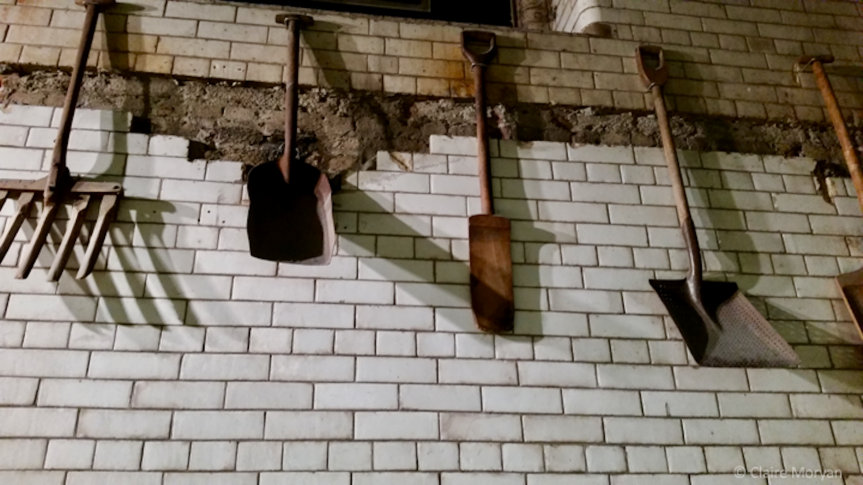
Tools used for barley. Photo my own

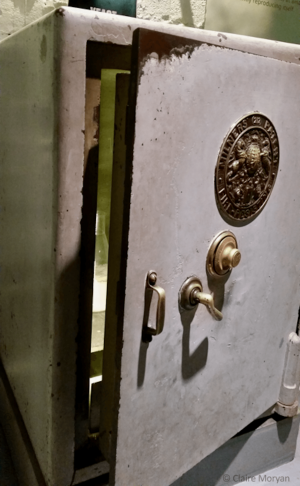
The storehouse begins with the essential ingredients of Guinness-making and beer-making in general, namely barley, hops, yeast, and water. The storehouse explains why each ingredient is used and how much Guinness uses of each. Making Guinness seems to lie in tradition, as the brewery buys each ingredient from the same regions (for example, the water used in the brewing process is piped from the Wicklow Mountains, not from the nearby murky River Liffey). Such traditional values even produce legends. The legend is that, since Guinness yeast is always and only grown on site at St James’s Gate, it comes from the original strain Arthur Guinness used during his time as brewmaster. Whether or not it is the yeast from 1759, the brewery has transferred some yeast from one brew to the next to ensure consistency since the 19th century. Since consistency is key, some yeast is also continuously locked away in case catastrophe would mark the end of Guinness.
slide04.png
Yeast in a safe. Photo my own

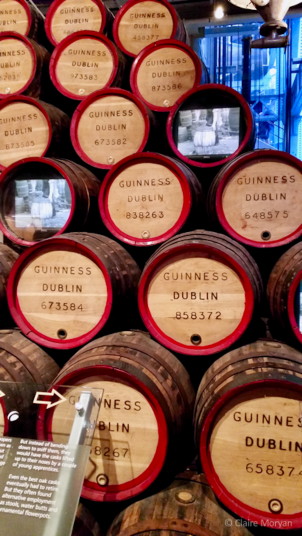
The next floors discuss transportation, advertisement, and tasting. Some sections, such as transport, are dealt with in passing, more to add flavor to the overall experience as opposed to the more academic treatment you would expect at a museum. What Guinness does as a museum, however, they do well and innovatively. The cooperage section, for example, not only displays the different tools needed to make barrels, but also describes the now obsolete process—it took years to become a master cooper—through a 1954 video of a Master Cooper making a new barrel. The advertising section, complete with a “zoo” of Guinness animal mascots, is complemented with a theatre, which plays Guinness commercials, and an iPad station where individuals can scroll through commercials, posters, and newspaper advertisements.
Slide1
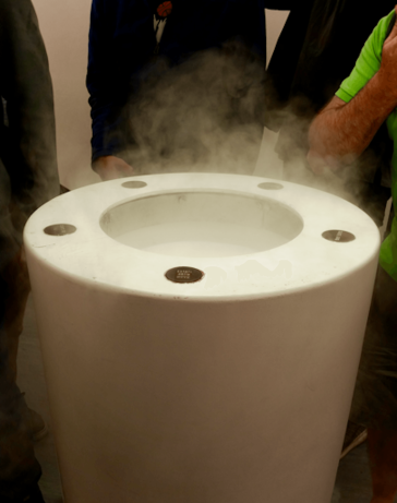
Atomizer. Photo my own

Another major highlight of the tour is the tasting experience on the second floor. Upon entering, the room feels like the Wonkavision room from Roald Dahl’s Charlie and the Chocolate Factory. The stark white room (lest the other senses be distracted) houses four atomizers that disperse the scents of Guinness’s ingredients for the visitors to smell. From there, the visitors grab a small taster of Guinness and are ushered into a dark room surrounded by portraits of the great men of the Guinness family (including Arthur himself) in order to drink the taster. While the atomizer half of the taster session is unlike anything else I have personally experienced, the dark tasting room seemed superfluous. Does one truly need portraits of the Guinness men in order to have a proper tasting?

The ticket into the storehouse comes with a complimentary pint or soft drink that can be exchanged once, but the visitor has several different options for how to exchange the ticket. One way is at the Gravity Bar on the seventh floor, a 360-degree glass-walled bar which provides breath-taking views the city’s sites. Another way is at the Guinness Academy on the fourth floor, where visitors learn to pour the “perfect pint” of Guinness (anyone who has seen a bartender pour a pint of Guinness knows there is a process).
Slide07
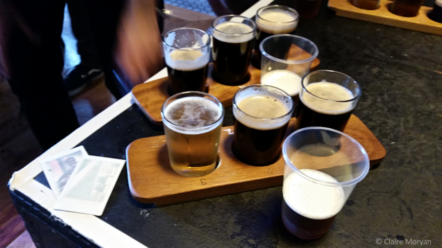
Flights of various Guinness at Gilroy’s. Photo my own

The third option is Gilroy’s on the second floor, where the ticket can be exchanged for a flight of three 1/3 pints from a choice of 8-9 varieties of Guinness. Regardless of the chosen exchange, definitely step into this last bar. Extra free tasters of new beers are passed around at the top of the hour (the Guinness Dublin Amber Pale Ale is phenomenal) and then as a surprise, Irish music and dancing ensues.
Slide12
Barrels and video from the cooperage section. Photo my own

Overall, the Guinness Storehouse is a great experience, but rather than a museum about beer, it is more like an amusement park for beer. While that is not a bad thing—it is fun, especially if you love the famous stout—the amusement park-like crowds become overwhelming in some of the confined spaces. Thus ensues some pushing and overcrowding.

The Guinness Storehouse is open seven days a week from 9:30 AM – 5 PM. Adult tickets depend on time of entry and “experience” add-ons, but start from €14 and include a complimentary pint or soft drink.
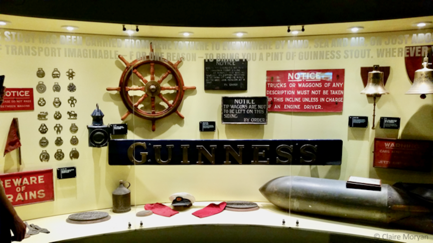
Slide06
Transportation section. Photo my own

Fast Forward: Painting from the 1980s

“I thought that if painting was dead, then it’s a good time to start painting.” – Julian Schnabel

Slide08
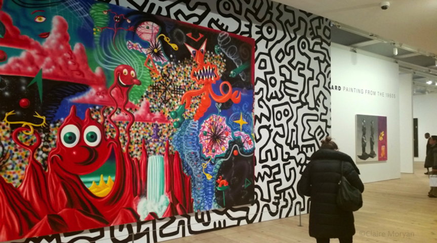
Installation shot of Fast Forward: Painting from the 1980s; Whitney Museum of American Art, January 27 – May 14 2017. Photo my own.


In art, the 1980s gave rise to new media like video and installation and galleries  that subverted the preconceptions of “high art”—sculptures, drawings, etc.—with “low art” of cartoons and graffiti. As these new, exciting media emerged, which led some to call oil paintings outdated. To challenge this, some contemporary artists in the 1980s decided to forge ahead and use paint to express new forms and ideas. Fast Forward: Painting from the 1980s, on display at the Whitney Museum of American Art until May 14, lauds these artists’ initiative to reenergize  a familiar medium.

Slide12
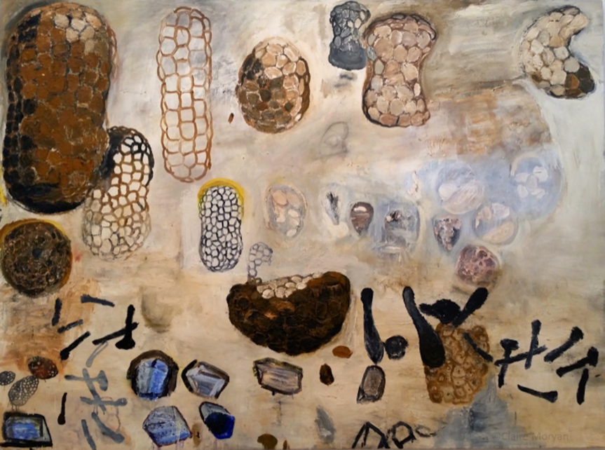
Terry Winters, “Good Government” (1984), oil on linen. Photo my own

The Whitney, as a museum, clearly takes pride in its  permanent collection, as many exhibitions, Fast Forward included, solely use objects selected from it. As its full name is  the Whitney Museum of American art, visitors should not be surprised that many of the artists in Fast Forward are American (although it should be noted that the Whitney holds many pieces from international artists, so long as they lived, worked, or created a substantial body of their oeuvre in the United States.)

This exhibition does not investigate deeply into the why’s and how’s of the 1980s painting revival. If visitors expect that of this exhibition, which hosts 44 works in three rooms, they will likely leave disappointed. Whether or not this was the museum team’s intention, the exhibition space on the 8th floor would not have the space to cover this background. It is difficult to determine whether the 8th floor of the museum—the smaller exhibition space—was chosen due to the others being taken up with the prominent  Whitney Biennial (opened March 17th).

Slide05
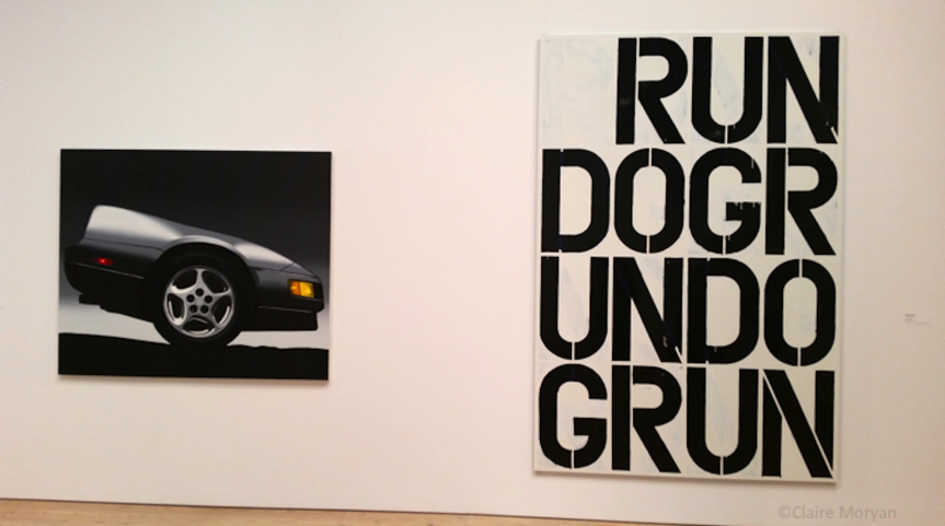
Installation shot of Peter Cain’s “Z” (1989) and Christopher Wool’s “Untitled” (1990). Photo my own

As a tasting session of the decade, Fast Forward is an excellent array of well-, better-, and unknown artists. The Whitney does not solely focus on celebrity artists from the decade. Certainly, famous artists—Jean-Michel Basquiat, Keith Haring, David Salle to name a few—are displayed prominently, but these works do not overshadow the others. For example, Basquiat and Haring are displayed on the exterior walls in the elevator foyer; these two juggernauts, then, battle against each other for the viewers’ attention, leaving the others in the exhibitions to their own proper, quiet contemplation. Other artists, like Peter Cain and Christopher Wool, are displayed the same way: on a wall together, separate but in conversation with others.

Slide14
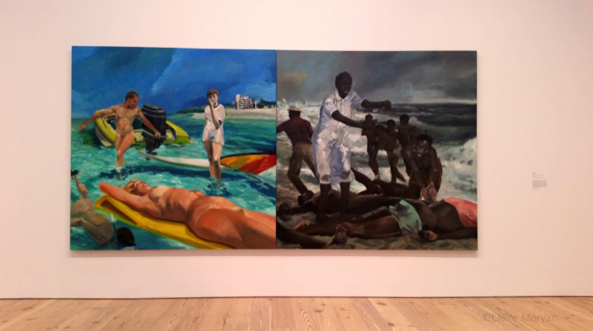
Installation shot of Eric Fischl’s “A Visit To/A Visit From/the Island” (1983), oil on canvas. Photo my own

The Museum does not stress that the rooms are themed, but whether unconsciously or consciously, the exhibition groups each room into similar themes or imagery. The outside walls are graffiti-inspired (where Basquiat and Haring are paired), the left room is politically-charged works, the middle room shows imagery appropriated from popular culture, and the right room is more abstract, meaning that, even with an underlying intention, the room of works is less straight forward or defined.

These themes might only be present so there is some sense of order, as the works seem to have tenuous relations at best. Eric Fischl (perhaps most known, now, for 9/11-inspired Tumbling Woman statue) is represented with a highly poignant work, A Visit To/ A Visit From/ the Island, comparing two similar beach compositions: the left depicts nude vacationers gaily playing in the ocean, while refugees escape the stormy seas on the right. Not to be outdone, across from Fischl is a painting by Leo Golub, which depicts soldiers laughing, comparing guns, and cleaning up the dead. The other three paintings, though interesting in their own right, do not hold a candle to these two evocative depictions, but there is no real connection to the commentary expressed, other than they are political and/or identity driven.

Slide10
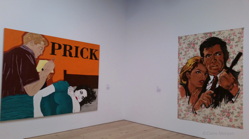
Installation shot of Kathe Burkhart’s “Prick:From the Liz Taylor Series (Suddenly Last Summer)” (1987) and Walter Robinson’s “Baron Sinister” (1986). Photo my own

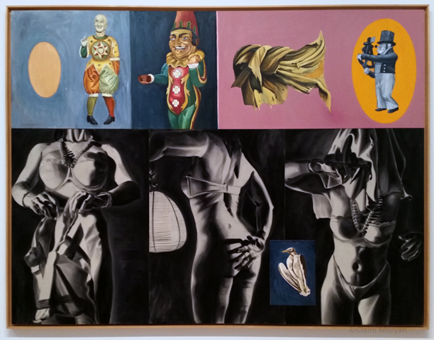
The middle room displays works of pop culture appropriation, as most works depict characters, actors, or objects from mass culture. Prick: From the Liz Taylor Series (Suddenly Last Summer” (1987) by Kathe Burkhart, depicts a movie scene with Taylor and Clint Montgomery, while Julian Schnabel’s Sextant of Dogtown, paints circus toys above images of a scantily clad woman deterring the camera.

Slide06
Julian Schnabel, Sextant of Dogtown () on canvas. Photo my own

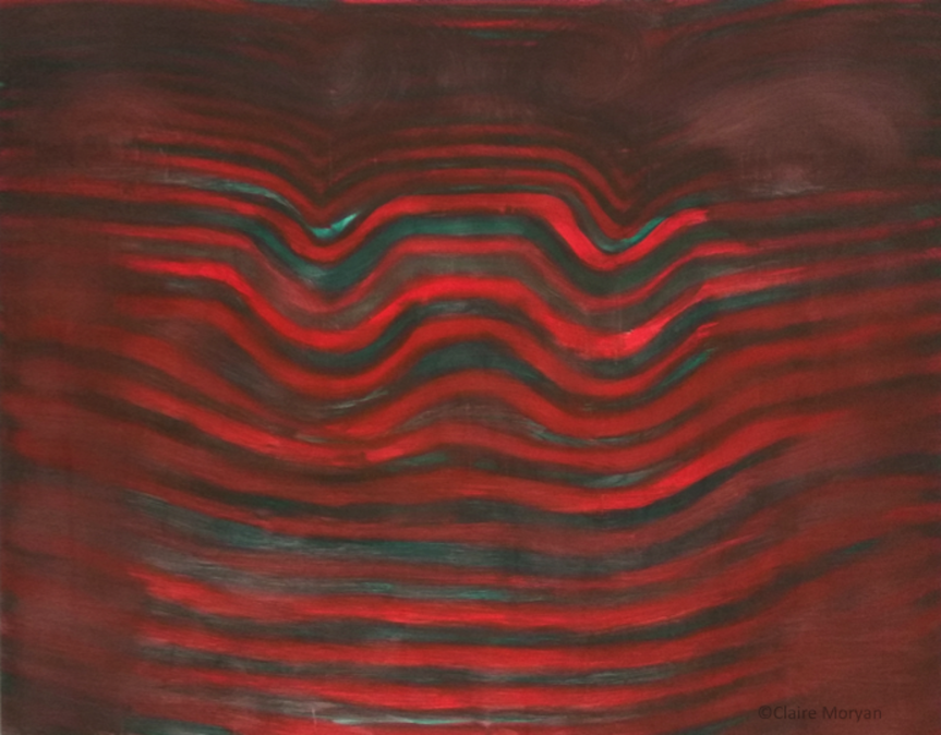
The last room, which had more abstract works, showed works with underlying themes of identity. For example, two works Count No Count by Ross Bleckner and Told by Carlos Alfonzo, deal with AIDs, diagnosis, and activism. The seemingly zigzagged lines painted by Moira Dryer take on a new life in portraiture when named Portrait of a Fingerprint. The diversity of this room’s subject matter leads to more open interpretation from the viewers.

Slide13
Moira Dryer, Portrait of a Fingerprint (1988), casein on plywood. Photo my own

The themed rooms were not the point of Fast Forward, although there hardly seems to be any true point to the exhibition other than to highlight the amount of 1980s paintings the Whitney has in its permanent collection. Due to the lack of space on the 8th floor, however, the exhibition  seems stilted. Many of these pieces are very large, with one taking a whole wall, such as Eric Fischl’s work and Schnabel’s Hope. Sixteen smaller works are hung Salon-style—a display with works hung above and below each other—on one wall in the pop culture room, which detracts from the emotional power that each could bring individually. The Whitney has displayed works Salon-style before, and the display can be a beautiful way to bring many similar subject matters together, such as in the Human Interests exhibition (see right image below). The difference between the exhibitions however, is size: Human Interests spanned two floors, whereas Fast Forward depicts 44 works (by less than 44 artists) in three small rooms. Therefore, nearly half of the artists shown are reduced to one wall, losing great names like David Wojnarowicz in a pictorial wash of pop culture appropriation.


Fast Forward feels, in a word, incomplete. This is likely due to the small exhibition space, which hinders growth and exploration. If presented like Human Interests, Fast Forward would leave the visitor with a greater sense of closure. Perhaps this signifies that the barriers 1980s painters broke did not end when 1989 turned into 1990; their changes to the medium continue to this day. As a brief survey of the decade, the Whitney successfully hits the target by including the bigger- and lesser-known names of the 80s painting scene.

Slide01
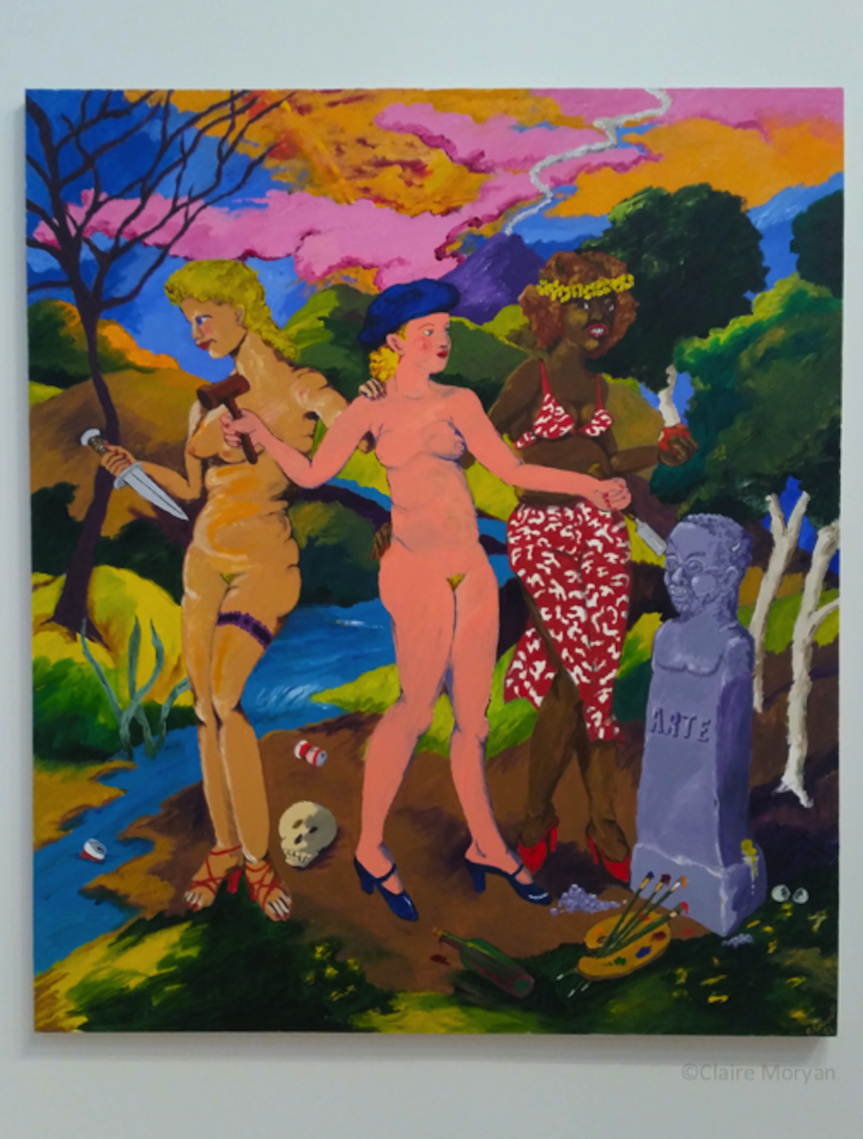
Robert Colescott, “The Three Graces: Art, Sex, and Death” (1981), acrylic on canvas. Photo my own


Japanese Impressions

slide03
Clark Art Insitute, Williamstown, MA

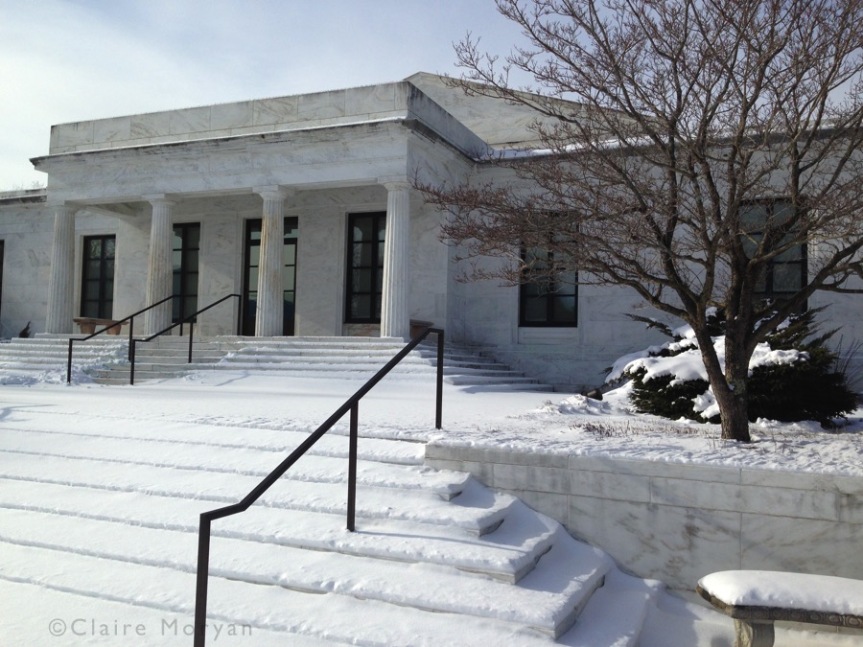
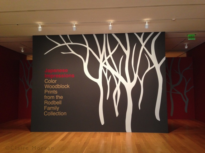
Tucked away in the Berkshires in Williamstown, Massachusetts, a surprisingly large art institution lies on the outskirts of the small university town. The Clark Art Institute, opened in 1955, is a leading research institution and public museum. Situated on 140 acres, the institute consists of the museum, research center, and conservation center, along with many walking trails. Clark’s mission promises a place where museum and higher education meet, hoping to advance the public’s knowledge of different genres of art. The current special exhibition Japanese Impressions is able to uphold this mission, introducing a Western audience to an unfamiliar art form.

slide05

The foundations of this exhibition are the gift of 63 prints from the Rodbell Family Collection in 2014. The exhibition spans the history of woodblock prints: beginning with the rise of the first generation in the late 18th and early 19th centuries, led by the superstars Hokusai (1760-1849) and Hiroshige (1797-1858) to the second generation of the 1920s and 1930s—divided between the traditionalists and those desiring more artistic freedom—and the modern third generation stemming from the latter group of the second generation. The exhibition proceeds chronologically, but groups the prints by artist. Therefore, visitors are treated to both stylistic progression of Japanese print and each artist’s oeuvre and contribution to the field at the same time.

The first generation created ukiyo-e or “pictures of the floating world”, a name that reflected the hedonistic lifestyle (ukiyo) of a newly wealthy merchant and middle class, who frequented theatres, brothels, and bought many ukiyo-e, which often depicted red-light district characters like geishas. The most famous artists in the Western world, Katsushika Hokusai and Utagawa Hiroshige, were part of this generation.

hokusai-tweaked
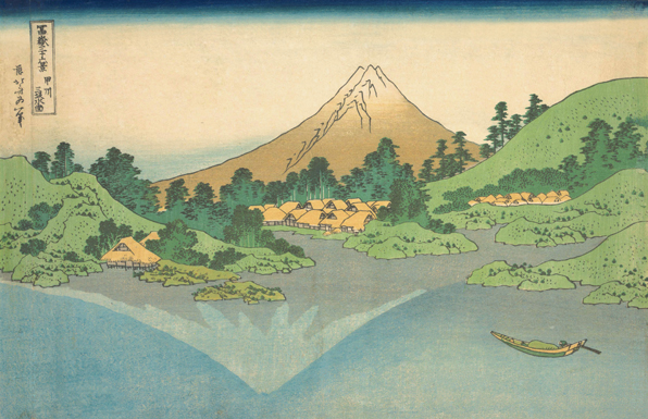
Hokusai, “The Surface of the Lake at Misaka in Kai Province” from “Thirty-Six Views of Mount Fuji”, 1830-31. Source: Clark Art Institute

The creation of ukiyo-e was a multi-step team project, as artistry, carving, and printing required different skills and thus the process enlisted many different people. First generation prints started with of an original colored drawing. The drawing was then transferred to wood panels. Usually, the number of panels needed correlated to the number of colors in the print. Since each wood block was inked with one different color, and carvers removed all parts which would not contain that color. The panels were then inked with their respective ink and printed in a specific order. Early on, small details and black outlines were hand painted after printing.

great_wave_off_kanagawa2
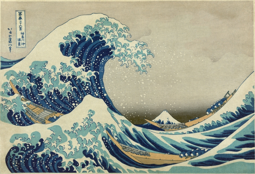
Hokusai, “The Great Wave off Kanagawa” from “One Hundred Views of Mount Fuji”.

With each section, the Clark introduces a new stylistic advancement into the ukiyo-e process. Hokusai was the first to create ukiyo-e depicting flora and fauna, and his 36 Views of Mount Fuji, of which the famous Great Wave is a part, emerged during the time Prussian blue, a pigment which up until that time had been prohibitively expensive, became more readily available. Until then, ukiyo-e were usually printed more monochromatically in red and green tones. Prussian blue created the opportunity to show greater depth, new hues, and was an instant wealth signifier.

Hiroshige experimented with asymmetrical views and bird’s eye view vantage points. Heavily influence by Hokusai, Hiroshige also produced the atypical nature ukiyo-e. Hiroshige marked the beginning of Western interest (Japonism), and was a large influence on van Gogh, who copies Hiroshige’s prints (see below). The exhibition also looks into the artist culture, in that students (like Hiroshige’s) often adopted the names of their sensei in order to gain associated fame.

The exhibition then flows into the discussion of the second generation, shin-hanga and sōsaku-hanga. Shin-hanga (“new prints”) artists sought to revitalize the traditional Japanese art during the early 20th century, and kept the division of labor present with ukiyo-e. Shin-hanga differed from ukiyo-e, however, by combining the modern (and Western) sense of Realism, natural light, and three-dimensionality with the traditional Japanese subject matter. Artistic influence both on and from the West is redolent within the second generation’s shin-hanga, and many artists tailored prints specifically for the Western audience. Yoshida Hiroshi became the first to sign his name in the Roman alphabet, perhaps the first Japanese artist to brand himself.

Concurrently, sōsaku-hanga, or “creative prints”, were developed from artists who assumed all duties pertaining to the creation of the print. As the sole creator, sōsaku-hanga artists were driven to self-expression, claiming to create art for art’s sake. These prints are more expressive, more abstract, and more gestural. From this half of the second generation stemmed the contemporary third generation of artists, like Saitō Kiyoshi, who balances traditional scenes with creative artistic innovation.

Japanese Impressions gives its Western audience a hearty glimpse into an artistic field that many in the West know little about. The exhibition, though, shies away from shunga, or pornographic images, which was a popular genre in early ukiyo-e. It is very likely that the collections that comprise this exhibition did not contain any of the perverse images. Although this is a rather adult topic—and it is not surprising to see it avoided in order to keep the exhibition child and family friendly—shunga was highly collected and displayed by different social classes and genders, and even famous artists like Hokusai created such images. To ignore shunga and its popularity seems to pass judgment or criticism on this pivotal aspect of the genre.

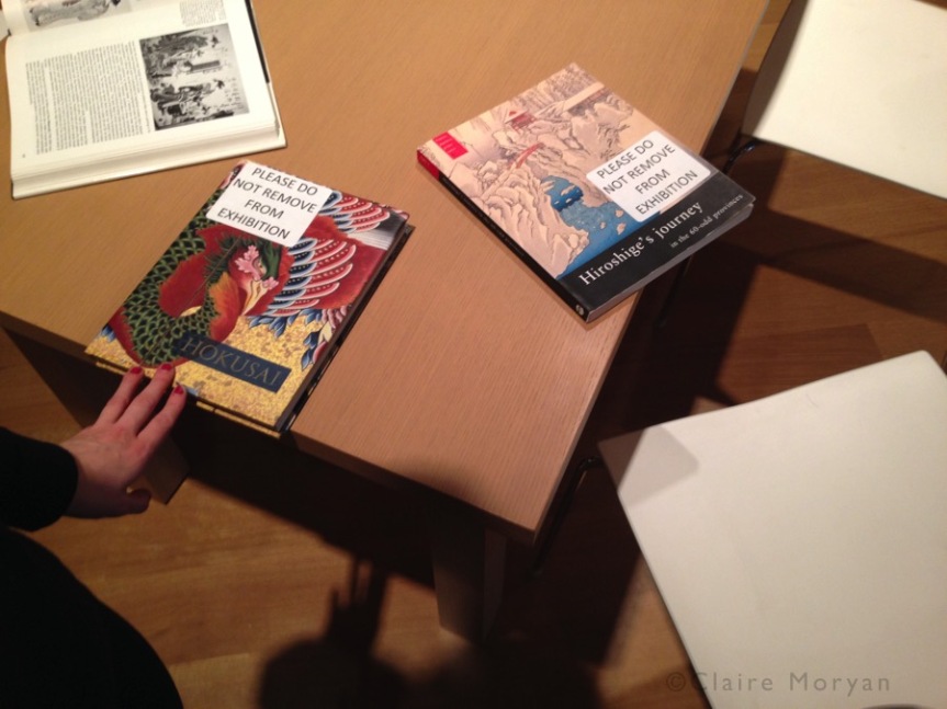
The last room contains books about the artists for the visitors to sit and skim or seriously study. On the wall a timeline maps the major developments in Japanese history and woodblock development. Next to the timeline is a detailed look at the creation process of ukiyo-e and a cipher for the different stamps seen on each print. A print could contain seals and inscriptions of any or all of the following: artist’s name and signature, the title, the date, the publisher, the public censor, the printer, the carver.


slide06

The step-by-step process, however, feels more appropriate at the beginning of the exhibition, as the amount of work and effort to make the prints might not be fully appreciated during the exhibition. The inclusion of the woodblock process suggests that the curators believed their target audience did not have previous knowledge of the trade. With this in mind, it seems more logical to place the process and seal key at the beginning, in order to create more understanding between the audience and the works—the exhibition’s mention of the introduction of Prussian blue in the artists’ works as well as the appreciation of the second generation artists who also carved and printed would resonate better.

Clearly its placement with the books in the last room was an aesthetic and practical decision: the timeline helped fill the space while also encouraging visitors to spend longer in the room and possibly read through the books (which they coincidentally could later buy in the shop).

It is a conscious decision to include or exclude an educational dialogue in an exhibition, and the curator must prepare accordingly whichever decision he or she makes. With an exhibition that involves a process that many Westerners might not know, the Clark has to determine the correct approach to their dialogue. Do they delight the visitors with the images and then enlighten? Or do you enlighten and then delight? The Clark chose to keep the magic of the “floating world” and then ground it in realism after; alternatively, presenting the process early would have initiated respect and wonder at the deftness of the artists, carvers, and printers to make the works dreamlike. 


slide10
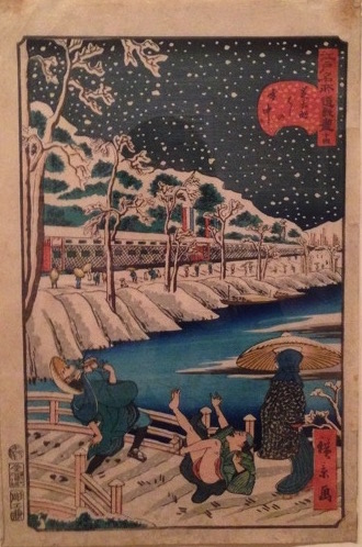
Utagawa Hirokage (Hiroshige III), from “Comical Views of Famous Places in Edo”. Photograph my own

Japanese Impressions runs until April 2nd at the Clark Art Institute. Admission includes full access to the special exhibitions and the Clark’s permanent collection, which is a fantastic array of American and European art from the 14th to 20th century.


Liu Wei: Center of the Earth | Transparent Land

Lehmann Maupin Gallery is currently showing Liu Wei, a Chinese conceptual artist that truly defies labels. The show extends across both of Lehmann Maupin’s New York locations, 536 W 22nd St in Chelsea and 201 Chrystie St on the Lower East Side. Both exhibitions are site-specific, meaning that Wei constructed the installations with the gallery spaces in mind.

slide04

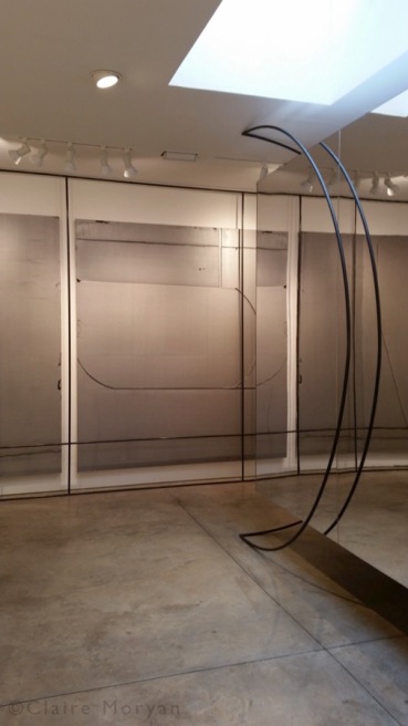
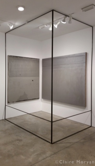
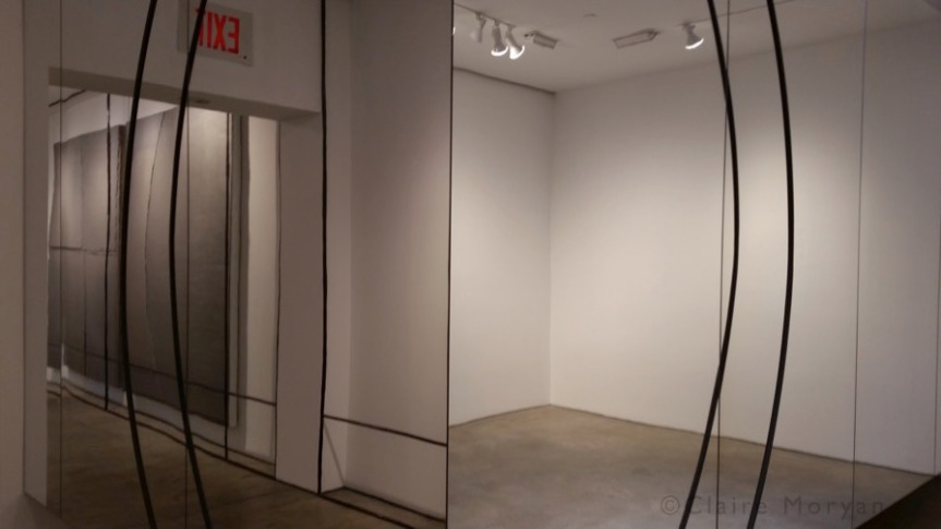
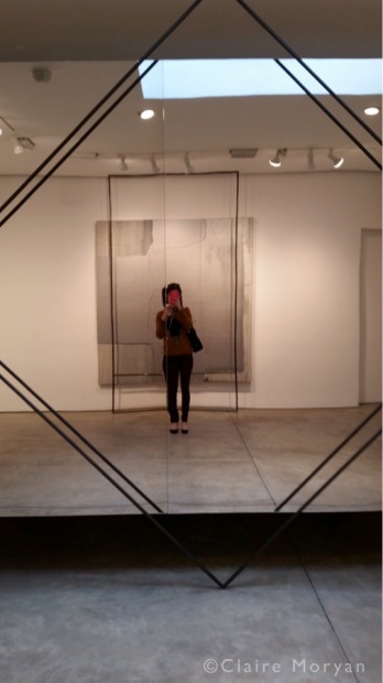
In a word, the Chelsea exhibition, “Center of the Earth”, is confounding. Wei manages to confuse and misdirect the visitor. The exhibition consists of a large installation of rods and mirrors accompanied by thick gray and silver paintings that can easily be mistaken for slabs of concrete.

slide08

The use of mirrors creates a sense of unity, as they reflect the paintings or pieces on the opposite site of the wall, making it unclear where one piece ends and another begins (or perhaps they are all one?). The reflections add to the confusion: how many rods are there? Is there glass pane here? Is that a concrete slab? Wei can distort perception and space with only a few materials.

slide03

Every turn creates a new vertiginous effect, and the mirrors force the spectator to become the spectacle, making it difficult to evade one’s own reflection and to “lose yourself” in the work. Visitors become conscious of themselves; while looking at the rods’ reflections, you cannot help but look at yourself as well, and perhaps fix your appearance.

slide07

Wei’s placement of the metal rods creates structure and rigidity over the mirrors’ fluidity. Likewise, the concrete-like paintings provide heaviness and strength against the levity of light and openness. Despite the industrial over and undertones, there is a dizzying etherealness to Liu Wei’s work.

slide10

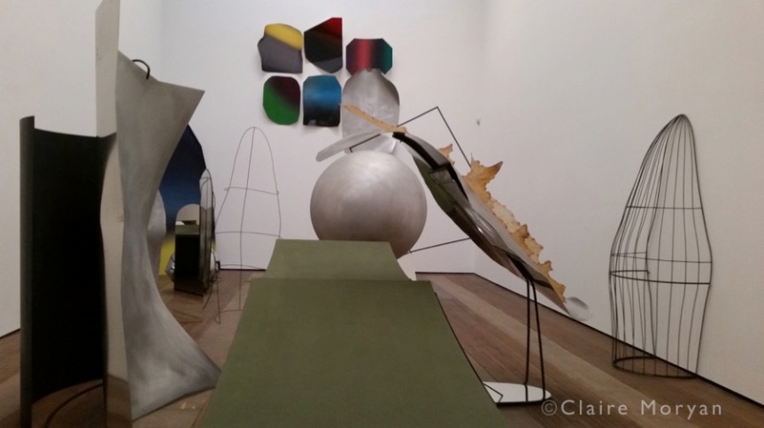
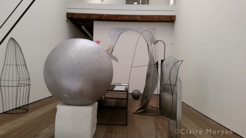
Oppositely, the installation on the Lower East Side, “Transparent Land”, is a visual overload and difficult to describe. In one large room, the installation consists of so many objects—three differently sized balls, painted steel cut-outs mounted on the walls, wire half-cages, mirrors, and a green structure that resembles a miniature golf course, to name a few—that at least one object is always out of your field of vision. There is a certain mechanical whimsy about it, like an industrial Wonka Factory.

slide12

Visitors must navigate through the Wei’s complex installation in order to see everything the exhibition has to offer. The curiosity of sights then transforms, thanks to Wei’s mastery of deception, to a curiosity or impulsion to touch in order to understand what you are looking at (you are not allowed to touch the exhibition).

slide14It would be incorrect to say that these two exhibitions went together; simultaneously, it is incorrect to say that they do not. The use of mirrors and steel rod-structures links the two installations together, but the essence and mood of each work could easily come from two separate artists. The fact that the same artist can create different, yet united, installations demonstrates how creative the mind can truly be. Through careful placement he is able to connect seemingly disparate items into a unique and united experience both individually and across two gallery spaces.

Lehmann Maupin will be showing Liu Wei’s installations until December 17. Both galleries are open Tuesday – Saturday; W 22nd St. is open 10 am – 6 pm and Chrystie St. is open 11 am – 6 pm.

Sunken Cities: Egypt’s Lost Worlds

20161026_111357
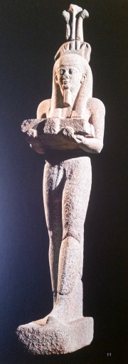
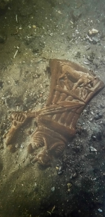
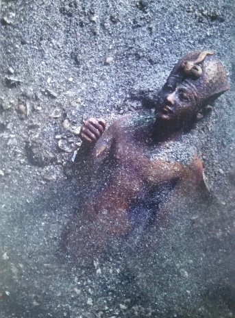
Bronze Statuette of a pharaoh discovered in the temple of Amun-Gereb in Thonis-Heracleion. Source: British Museum

Sunken Cities: Egypt’s Lost Worlds is currently showing at the British Museum. It is an exhibition on the underwater archaeological discovery of two coastal cities, which sunk into the Mediterranean more than a thousand years ago. Perhaps ever since The Treasures of Tutankhamen in the 1970s, exhibitions on ancient civilizations have consistently been “blockbuster shows”, and Sunken Cities at the British Museum is no exception. Lost treasure is a lodestone, drawing in larges numbers of visitors from all kinds of disciplines. Its subject matter is naturally exciting: the idea of finding ancient, previously hidden, treasure like the search for the city of Atlantis.

Hidden in plain sight for over a thousand years, Thonis-Heracleion and Canopus are the new Pompeii and Herculaneum. Submerged for a millennium, many of the objects are very well preserved, but with only a small fraction having been raised up from the seabed, there will be more discoveries to come. The demise of the two cities has given us a “day in the life” feeling, as if they were frozen in time. Objects on display include daily objects like jewelry, coins, plates, and ladles, but also objects that shaped foreign relations and religion, like decrees and votive statues.

20161026_111529
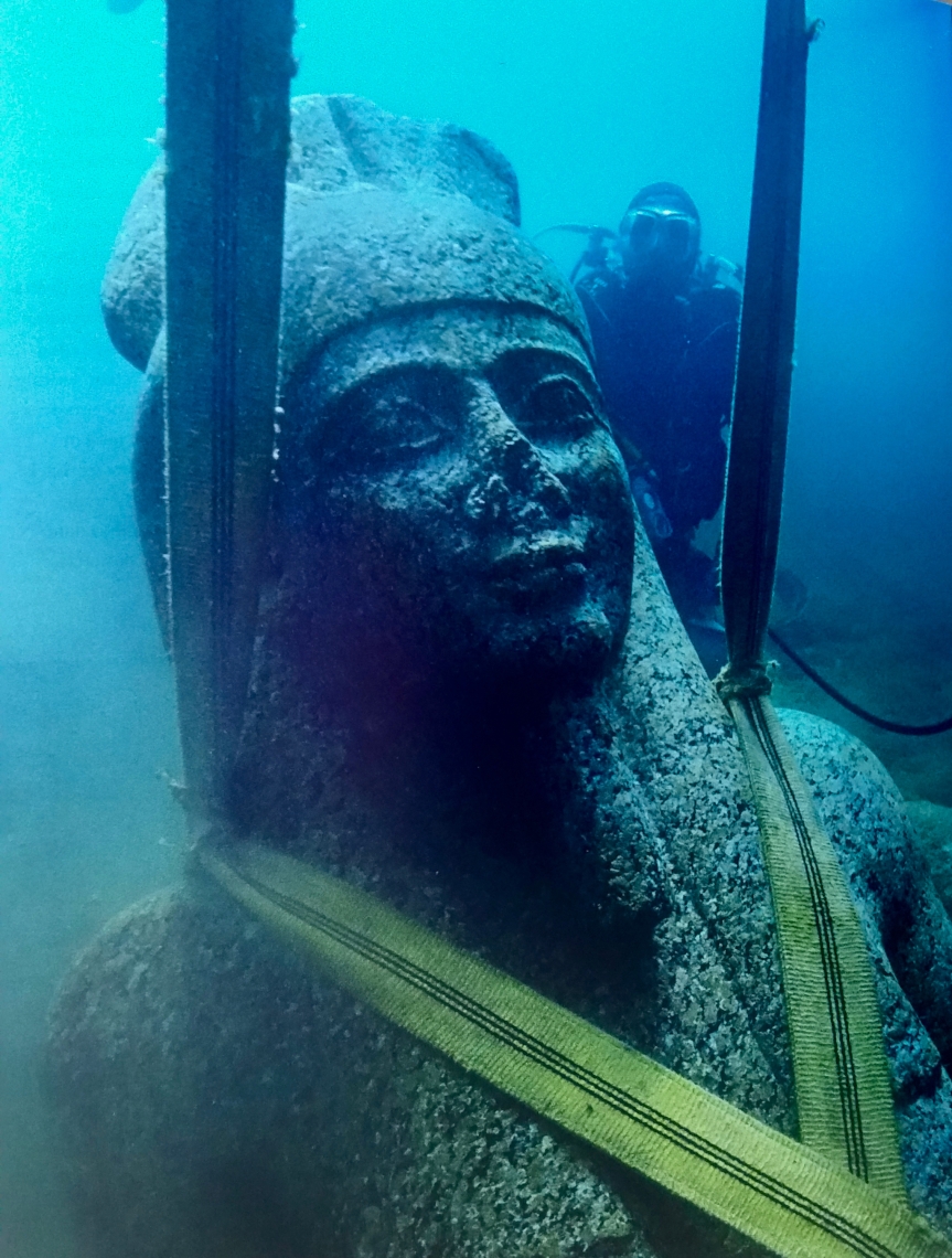
Statue of Hapy. Thonis-Heracleion. Red Granite. Maritime Museum, Alexandria. Source: British Museum

The first room consists of an informational video, which covers a brief history of Thonis-Heracleion and Canopus and their re-discovery and excavation. While informative, the video would be more ideal in an enclosed space, as visitors can hear the audio in the next two rooms, which can be distracting. In the same room as the video stands the wonderfully preserved and colossal statue  (over 5 meters high) of Hapy, the god of the annual Nile flood. In Thonis-Heracleion, this statue stood at the entrance of the harbor and welcomed seafaring traders and foreigners into the city. In a nice echo, Hapy stands at the entrance to the exhibit, welcoming guests into the world of Thonis-Heracleion.

The exhibition focuses on the special relationship formed between Egyptians and the Greeks that came to settle there, and also briefly discusses Egypt under Rome. The Greco-Egyptian relations began around four centuries before Alexander the Great conquered Egypt and lasted at least four centuries after his death. The cultural exchange began in earnest when, in the 7th century BC, the pharaoh Psamtik I hired Greek mercenaries to expand his army. In addition to these soldiers of fortune, Greek merchants also settled in the verdant Nile delta. The museum explains that the Greek immigrants accepted many Egyptian religious elements and made connections between Egyptian deities and their gods. Greeks saw Dionysus in the Egyptian Osiris, and Herakles in Horus. The British Museum produced a helpful list of the equivalent gods for visitors to the exhibition, as many visitors are likely to know the Greek gods but perhaps not as many of the Egyptian deities.

20161026_112246
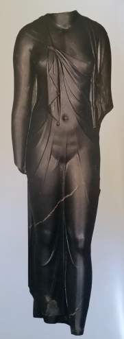
Queen Arsinoe II. Canopus. Black granodiorite. Bibliotheca Alexandria Antiquities Museum SCA 208. Source: British Museum

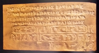
Even after Alexander’s expansion of his Greek Empire into Egypt, the Greeks did not force their mores and customs on the Egyptians and the peaceful coexistence of peoples and cultures continued. Alexander and his successors, the Ptolemies, sought to further secure the throne by welcoming and assimilating Egyptian traditions. Alexander celebrated Egyptian festivals like the Osiris Mysteries, which were strictly observed by citizens of Thonis-Heracleion. Alexander and the successors adopted Egyptian clothes and customs, and dedicated foundation plaques in both Greek and hieroglyphs. Sculptures of the pharaohs and queens mixed both Egyptian and Greek styles. Soon, too, the Greek pharaohs created gods to unite the Greeks living among the Egyptians, most notably Serapis, who embodied Zeus, Osiris and Asclepius, and whose popular cult traveled back to Greece. The exhibition supports these facts with material evidence on display. A fascinating point was the Egyptian reaction to Alexander’s rule: his defeat of the Persians was seen as the restoration of the original pharaohs, despite his Macedonian roots.

20161026_112335
Foundation Plaque. 221-204 BC. Alexandria. Gold. Graeco-Roman Museum, Alexandria P.10035. Source: British Museum

One caveat: not all the objects in the exhibition are from the excavations of Thonis-Heracleion and Canopus. To date, only 5% of the cities’ objects have been excavated, leaving much more to be discovered, but few artifacts to fill a multi-roomed exhibition. Many objects come from another major Egyptian harbor city, Naukratis. Thonis-Heracleion and Naukratis were both thriving trading hubs and often interlinked for various tax decrees and religious festivals. As both were also ports for Greek traders and settlers, the artifacts found in Naukratis give similar insight to Greek life in Egypt. Thankfully, the British Museum does not try to hide this as they openly label which objects are the recent discoveries from the two underwater cities and which are not.

The exhibition’s strength lies in the inclusion of excavation photographs and videos taken from the bottom of the Mediterranean. Being able to see artifacts in situ puts the artifacts’ discovery in perspective for us. The photographs remind the visitors that these objects were, until recently, hidden by the murky water of the Mediterranean.

20161026_112605
The god Bes as a warrior. 3rd-2nd century BC. Thonis-Heracleion. Terracotta. Maritime Museum, Alexandria SCA 1586. Source: British Museum

Photography and (of course) touching is not allowed in the exhibition, but the British Museum makes up for the latter by establishing an object-handling table in the ticket collection area. The booth can be easily overlooked, so make sure to visit before entering the exhibition. The museum provides objects from their own collection similar to those in the exhibition, and permits visitors to touch and inspect them and ask questions. Object handling is often the only chance visitors are allowed to touch artifacts and can sometimes challenge assumptions—one visitor near me was surprised how heavy the Greek tetradrachm, a silver coin roughly the diameter of a half dollar/50p coin, actually was (17.2g).

Engaging children in exhibitions can sometimes be daunting, especially for topics like archaeology. The British Museum, however, executed their children’s stations innovatively. They discussed objects on display, but often focused on what it would be like to be a diver discovering these artifacts. Stations supplied headphones with underwater sounds like waves and bubbles, goggles to look through, and flashlights so children could use their imagination to experience underwater exploration.

20161026_111725
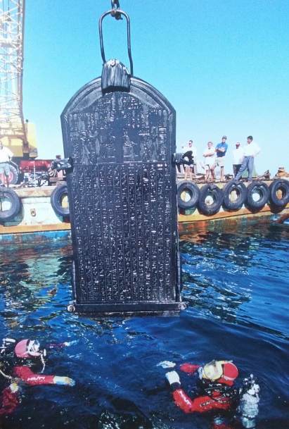
The Thonis-Heraclein stele, featuring the Decrees of Sais, is lifted from the sea. Source: British Museum

Sunken Cities easily delights both scholars and laymen because of new and reaffirming insights into Greco-Egyptian relations. These objects were used over a thousand years ago and the fact that some emerge from 30ft of water in very good condition is amazing. It is interesting to consider how these artifacts would have affected us if they were discovered earlier. For example, objects like foundation plaques and the Decree of Sais have both Greek inscriptions and hieroglyphs. Had these been found first, perhaps they would have been our Rosetta Stone. Nevertheless, the future discoveries at Thonis-Heracleion and Canopus are sure to elucidate more into the lives of the ancient Egyptians and their Greek neighbors.

Sunken Cities: Egypt’s Lost Worlds is at the British Museum until November 27. Adult tickets are £15.

20161026_111558
Statue of Hapy being raised from underwater. Source: British Museum

David Hockney: 82 Portraits and 1 Still-Life

20160919_134510
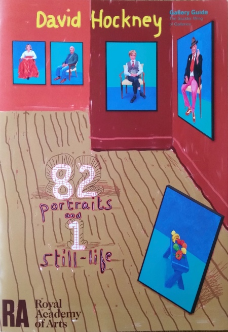
Exhibition pamphlet cover, drawn by Hockney. Source: RA exhibition pamphlet.

The Royal Academy of Arts in London always guarantees its visitors a well-researched and curated exhibition. Epic texts decorate each room, detailing every moment of an artist’s life from start to finish. Although many museums do this, the RA definitely does not shy from loquaciousness. Once, in the 2014 Anselm Kiefer show, they included a whole poem—about five stanzas long—in German and English translation in one wall label. It therefore felt unfamiliar to step into a show virtually without words, as was the case for David Hockney: 82 Portraits and 1 Still-Life. Paintings line the walls, packed closely to each other, allowing only enough space to briefly spy the bright red walls. The sole description for each painting is the sitter’s name, with no indication as to who these people are. No sitter is of “celebrity fame”: some are famous in the art world, like Larry Gagosian and John Baldessari; others are the painter’s siblings, children of friends, and other “unknowns.”

Technically, the title is wrong. This show contains 82 paintings total: 81 portraits and 1 still-life. Upon entering, the initial effect is overwhelming; a sea of blue, turquoise, and purple, with 81 faces (and 1 still life) staring back at you. Hockney considers these (and others not in the show, totaling to over 90 portraits) as one body of work, and it is not surprising to see why. The portraits are the same size, executed in the same medium, and, with the exception of one (not the still-life), have the same type of background. This cohesion and close proximity provides a fluid movement from one portrait to the next, allowing the visitor to spend as little or long with each. 82 works of similar subject matter make it difficult to pick a favorite, however the visitors who do, seem to pick differently, with each portrait having its own distinct charm.

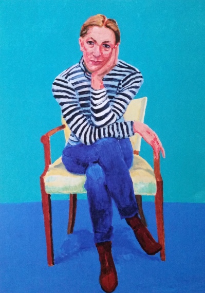
Such a unique exhibition—an 82-tych, so to speak—deserves a different type of exhibition pamphlet, which the RA delivers. For an exhibition on an artist whose career spans over 50 years, the overview details Hockney’s life since 2004, and discusses his modus operandi for this body of works. The pamphlet also selects a few of the sitters on whom to elaborate. The RA’s trump card, however, is the fact that one of its curators, Edith Devaney, sat for Hockney twice during this series. The pamphlet’s inclusion of her account of Hockney’s actions and demeanor during the three days she sat for each painting provides a special insight that few others could offer. This creates an intimacy among the visitors, the artists, and the artwork.

20160919_134537
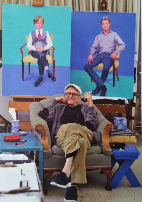
David Hockney in Los Angeles. Photo by Jean-Pierre Gonçalves de Lima. Source: RA exhibition pamphlet.

David Hockney was born in Bradford, England, in 1937. He attended the Royal Academy, and was not allowed to graduate in 1962 when he refused to write an essay for the final examination. He argued he should have only been graded on his works. 82 Portraits and 1 Still-Life contains the same outlook 54 years later. No words are available to cloud the viewers’ judgment; the art speaks for itself.

No text leads to no assumptions, which forces the visitor to rely on imagination and perception skills. This differs greatly from the National Gallery’s Goya exhibition, which provided in depth biographies and art criticism for nearly all of the pieces in the Gallery. Rather than letting visitors see the glint of pride in a portrait’s eyes for themselves, the National Gallery told them to look for it.

With a cursory examination, Hockey’s technical mastery seemingly falls short, especially when compared to Goya’s ability with portraiture. But upon closer inspection, it is not that Hockney lacks these skills, but rather foregoes his use of them. Arms and legs are sometimes out of proportion and the colors are highly saturated, but then true genius flashes, like effortlessly portraying a sheer shirt’s impression on and away from the skin.

20160919_134630
David Hockney. “Edith Devaney, 11th, 12th, 13th February 2016” postcard. Original painting: acrylic on Canvas.

Like Goya, Hockney has the ability to capture the sitter’s aura—arguably Goya’s special talent—as if it lived inside the painting. Perhaps, though, it is because of the unusual autonomy Hockney’s sitters had. According the Edith Devaney’s personal account, sitters were allowed to dress and sit how they wanted, with little input or direction from Hockney. More likely it is the highly nuanced face (more so than the body) that instills the life force into the piece. Some sitters’ eyes seemingly shine; others’ lips crack sly smiles. Their sitting postures and positions, too, convey open or closed personalities. Hockney painted some sitters more than once, but the RA pared down the number of recurring sitters in the show, which is unfortunate since seeing the same person painted again and again demonstrates how Hockney captured a new side of the sitter each time.

The same background and the same chair reinforce the different styles and personalities of each sitter, but the collective body reveals certain aspects of Hockney’s own psyche. Having come back from a stroke in 2012, Hockney must have felt unsure about painting. As the paintings progress, so too does his confidence in himself and his medium, acrylic, which the RA states he had not used in a long time. Hockney “paints what he sees” and creates 82 inherently truthful paintings.

82 Portraits and 1 Still-Life is exhibited at the Royal Academy of Arts in London until October 2nd. Tickets are £11.50 for adults, with concessions available, and under-16s go free with a paid adult ticket. The Royal Academy is open Saturday – Thursday 10am – 6pm and Friday 10am – 10pm.

Skibbereen Famine Exhibition

Slide1
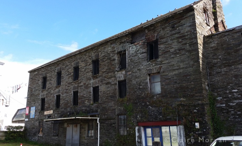
Skibbereen Heritage Centre

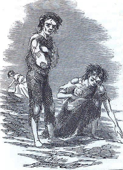
Throughout Ireland, many cities have some kind of memorial to the Great Famine (or Great Hunger), which ravaged the potato crops in the 1840s. The whole island was affected, but western Ireland and County Cork were extremely hurt. Journalists and artists were told to visit Skibbereen and its surrounding areas, described as “the very nucleus of famine and disease” (Dufferin and Boyle, 1847). With Skibbereen having been the epicenter of the famine, it seems fitting that there is an in-depth exhibition there, analyzing the Famine and its economic and physical effects. Opened in 2000, the Great Famine Commemoration Exhibition is on permanent display at the Skibbereen Heritage Centre.

The exhibition focuses mainly on the potato blight in Ireland and the panic, poverty, and squalor it produced. Ireland, however, was not the locus of the famine; in actuality the disease Phytophthora infestans traveled to Europe from North America, with Belgium first affected. The failure of the potato crop led to famine in Ireland because of the disproportionately large dependence on potatoes: one-third of the Irish population solely relied on the crop for economic or nutritional means. Most poor families’ diets nearly completely comprised of potato, which they usually grew themselves. The famine resulted in mass poverty, death, and emigration, causing 1 million people to die and 1 million more to emigrate. Ireland’s population fell 20-25% over the course of the 7-year famine. Even 170 years later, the island’s population has still not recovered: in 1845, over 8.5 million people lived in Ireland; as of 2011, the population was 6.4 million (including Northern Ireland).

Patate_famine
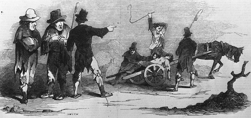
“La Grande Famine, illustration du Illustrated London News par Smyth ,1847.” by Samuel Austin is licensed under CC BY-SA 3.0

With few physical objects and no original primary documents, the exhibition redeems itself with dioramas, text, videos, and interactive material. The videos humanize the famine, as actors enact committee meetings, transcriptions of letters, and council tribunals, presenting upsetting tales of death, sickness, starvation, and abject poverty. These reenactments bring history back to life and act as addendums to the exhibition text. Objective text discussing death and poverty becomes less detached from history when presented as a mourning daughter recounting her father’s death due to starvation, or a farm laborer struggling to find the words to describe how dire his family’s situation is. Equally disturbing are the reenactments to show that the government’s relief plan failed to adequately support the starving: the relief equaled the average wage, 8 pence a day, on which a family could live during pre-famine times because they relied on their self-grown potatoes for sustenance. With no potatoes, the government imported corn with a daily ration costing 32 pence, making it impossible for workers to get enough to eat.

Touch-screens allow visitors to scroll through different written accounts of the famine, especially the appalling conditions in Skibbereen, and read briefly about the famine across Europe. Visitors learn of “Souperism”, the practice of missionaries giving food to those who willingly convert to Protestantism, and of statistics like the precipitous decline in small farm holdings during the famine. If visitors read and interact with every object, the rooms easily consume two hours.

Slide8

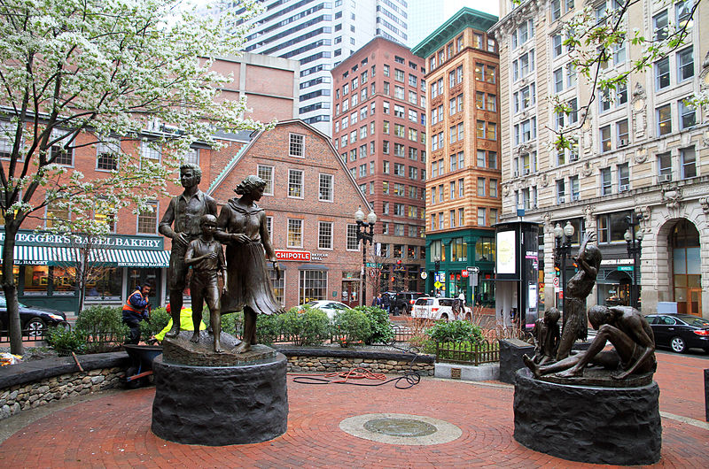
Tucked away in the last corner hang charts of demographic changes due to the famine, including the diaspora of Irish-born emigrants in America. Many Irish immigrants settled in New England and the Mid-Atlantic states (by the 1850s, the ratio of Irish-born to not in Massachusetts was 5.5:1. It is no wonder Boston erected a Great Famine memorial of its own).

800px-USA-Irish_Famine_Memorial0
“Boston Irish Famine Memorial” by Ingfbruno is licensed under CC BY-SA 3.0

Preserving memory and history remains a difficult task for museums and historical societies. Every moment in history has many different perspectives and good interpretation means exposing the visitor to as many voices as possible. Presenting painful history is a particularly daunting challenge because curators must present harrowing points in history without accidentally glorifying the evil actions.

The Great Famine Exhibition conveys the view that the famine was an unforeseeable and unpreventable natural occurrence. But to historians and past contemporaries, the famine could have been avoided. The exhibition conveys that the government had not given enough relief. Panels, hung very high on the walls, chronicle important moments of the famine, including Prime Minister Robert Peel’s import of American corn to alleviate hunger in 1845, when only a third of the crop was destroyed. Six months later, we learn newly elected Lord John Russell revoked the import policy, right before the blight destroyed nearly the entire crop. The government apparently considered the famine a sign of providence, which could not be mollified, but a continuation of aid would have certainly ameliorated the hunger.

Skibbereen_by_James_Mahony,_1847
The scene at Skibbereen, west Cork, in 1847. By James Mahony for Illustrated London News.

As an exhibition that succeeds in conveying Irish sentiment during the famine, it surprisingly does not mention the strong contemporary criticism of the English government, which claimed it failed to act properly or even completely ignored the problem. Lord Clarendon, the Lord Lieutenant of Ireland, wrote to Russell in 1849 for more aid, stating, “I don’t think there is another legislature in Europe that would disregard such suffering as now exists in the west of Ireland, or coldly persist in a policy of extermination”(Woodham-Smith, 1962). As if adding to this, John Mitchel of the Young Ireland Movement wrote in 1860:

“I have called it an artificial famine: that is to say, it was a famine which desolated a rich and fertile island that produced every year abundance and superabundance to sustain all her people and many more. The English, indeed, call the famine a ‘dispensation of Providence;’ and ascribe it entirely to the blight on potatoes. But potatoes failed in like manner all over Europe; yet there was no famine save in Ireland. The British account of the matter, then, is first, a fraud; second, a blasphemy. The Almighty, indeed, sent the potato blight, but the English created the famine.” (Gallagher, 1987)

To the Irish, no other country starved, and no other country would let them starve like England did. While it may be contentious for the Skibbereen Heritage Centre to claim the British government failed to help its colony, it is an important argument that should be acknowledged and assessed, since it is likely that this treatment only spurred indignation, over which citizens ruminated until 1916.

Slide2
Site of a famine soup kitchen, next door to the Heritage Centre.

Smaller, niche museums should never be taken for granted. They may pale in comparison when compared to museum Goliaths, but they provide the opportunity to focus on a singular issue and give it the treatment it deserves. The Great Famine Commemoration Exhibition excels in conveying the feelings of the everyday citizen during the famine, drawing out pathos from the visitor. Early on, the exhibition impresses on the visitors the Irish poor’s dependency on the potato, and the harrowing circumstances evoke sympathy for the dead. The starvation and suffering is shown as the clear impetus for the mass emigration. While the exhibition could have offered more interpretation of government assistance, it presented a local, national, and sometimes international story of tragedy skillfully and neatly.

The Skibbereen Heritage Centre is open Mid-March to the end of October, 10am–6pm. During high season (Mid-May to Mid-September), it is open Monday-Saturday. Outside high season, it is open Tuesday-Saturday. The centre is €6 for adults, €4.50 for students and senior citizens, and €3 for children under 14. Family and group (10+ people) rates are available upon request.

Slide3


References:

Lord Dufferin and the Hon. G.F. Boyle (1847), Narrative of a Journey from Oxford to Skibbereen during the Year of the Irish Famine.

Gallagher, Thomas (1987), Paddy’s Lament, Ireland 1846–1847: Prelude to Hatred, Houghton Mifflin Harcourt.

Woodham-Smith, Cecil (1962), The Great Hunger: Ireland 1845–1849, Penguin

Kaleidoscope

Slide2

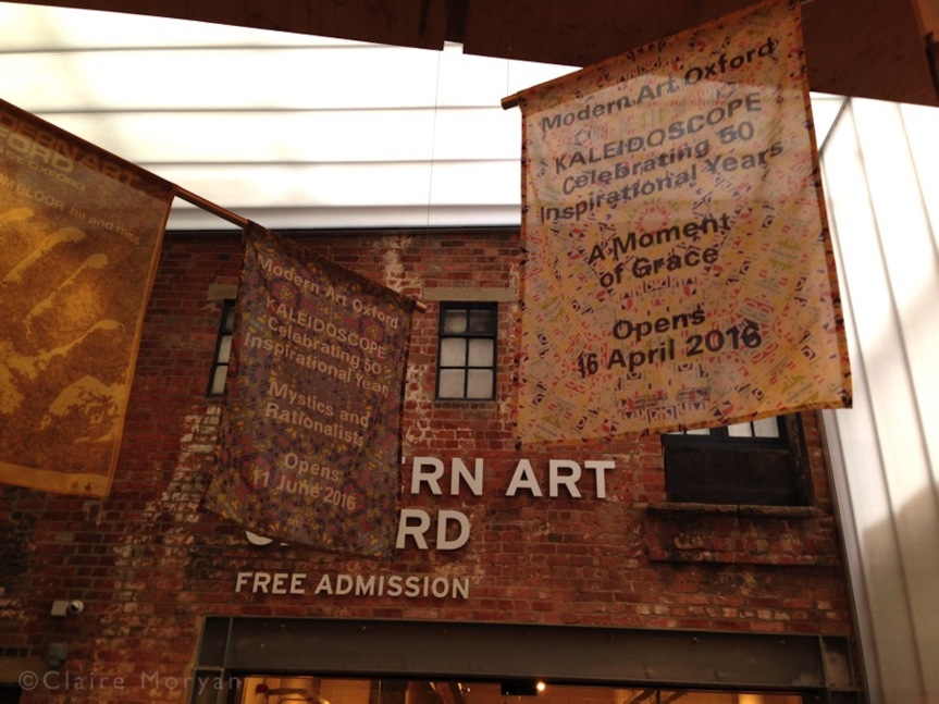
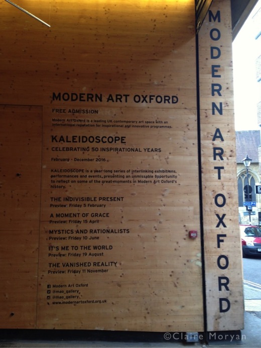
Modern Art Oxford has created an exciting program to celebrate its golden anniversary this year. In its first 50 years the museum has hosted over 700 exhibitions, and Kaleidoscope acts both as a retrospective of those and as a new exhibition.

Displaying works by artists previously shown at the museum, Kaleidoscope creates a yearlong program made of five interlinking exhibitions. These exhibitions replace one another without closures for installations. According to the museum, Kaleidoscope “offers a snapshot of some of the many highlights in our history and reflects on some of the key ideas in contemporary art over the past half a century.” This review discusses the idea behind Kaleidoscope in general, rather than any of the specific exhibitions. Treating Kaleidoscope as five stand-alone exhibitions with their own separate themes would not reflect Modern Art Oxford’s intention: to have a rolling exhibition consisting of five different but interlinking concepts.

Slide1

Each exhibition title references a quote from one of the artists displayed. Mystics and Rationalists, the exhibition on at the time of writing, centers on artists’ ability to produce new expressions of knowledge through atypical approaches. Its title comes from Sol LeWitt: “conceptual artists are mystics rather than rationalists. They leap to conclusions which logic cannot reach.” One of the previous exhibitions, A Moment of Grace—from Gustav Metzger’s comment that “every step in nature is a moment of grace”—displayed artistic activism, which critiqued religion, politics, and consumerism.

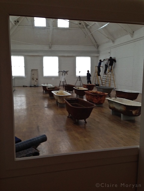
When museums normally install an exhibition, they close the space for about a month while they de-install the previous exhibition’s objects and prep the room for the next exhibition. The Kaleidoscope exhibitions flow from one to the next without fully closing the space, providing non-stop access. For example, at the time of my visit, one half of the A Moment of Grace closed down in order to start installing Mystics and Rationalists. Visitors were still able to walk around the remaining half of A Moment of Grace during this time, and when it was time to de-install that side, visitors then roamed the first half of Mystics and Rationalists. Mystics and Rationalists will likewise transition into It’s Me to the World from July 31 and August 20. In an air of transparency, a window is provided into the “transitioning” room, allowing visitors to peer in and see the installation process. The sneak peek into the new exhibition gives the visitor some insight into the amount of work required to create a temporary exhibition.

Slide4

While this approach is refreshing, it also forms part of the downside to Kaleidoscope. A yearlong rotation of five exhibitions means visitors from further afield cannot see the full realization of the museum’s vision. Unless someone is able to visit every two months, they see only one-fifth of Kaleidoscope. The live transitions further shorten the experience: out of 19 possible pieces by ten artists, I was only able to see 6 works by 5 artists due to installation and a room closed for object repairs. Kaleidoscope’s visionary idea halved my time at A Moment of Grace, reducing my visit to 1/10 of the entire Kaleidoscope concept.

Therefore, visiting during installation greatly inhibits the experience, and non-local visitors should research the timetables and visit Kaleidoscope when an exhibition is fully up and running. Looking into the installing process is intriguing, but ultimately disappointing since a whole space is reduced to a window. A better way to champion museum transparency would be allowing visitors to walk into the transitioning rooms, but that is generally impossible for health and safety reasons. Modern Art Oxford website supplies these time frames.

People in the Oxford area, however, should take advantage of their proximity and the museum’s free admission and pop into the museum often in order to gain the unique behind-the-scenes access Kaleidoscope offers.

Kaleidoscope runs until December 31. Modern Art Oxford is open every day but Monday. Admission is free.

Shakespeare’s Dead

Screen Shot 2016-06-20 at 9.54.01 PM.png
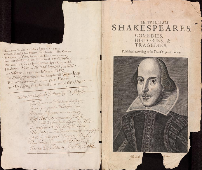
Digital facsimile of the Bodleian First Folio of Shakespeare’s play, Arch. G c.7. Source: http://firstfolio.bodleian.ox.ac.uk/book.html

It can seem a bit morbid to celebrate the anniversary of someone’s death.

The University of Oxford’s Bodleian Library, however, have decided to mark the 400th anniversary of the death William Shakespeare with an exhibition about death itself.

Shakespeare’s Dead is a play on both the contraction “Shakespeare is dead” and the possessive “the dead of Shakespeare”; it focuses its discussion on death both inside and outside of Shakespeare’s literary oeuvre. The exhibition’s curators look at the different aspects of death and dying in the late 16th century, including depictions in literary works, religious rites and superstitions, and the threat from the plague. The exhibition features books, frescos, and historical texts and documents, nearly all of which come from the Bodleian Library’s rich collection of unique treasures. The part of the exhibition most likely to draw crowds is the first and early editions of the Bard’s plays. Prominently displayed is the 1623 first folio of collected works acquired by the Library in 1625 (apparently, Lord Bodley considered Shakespeare to be “baggage books”, which would soil the Library). Along with these headline items, visitors will also see medical books, decrees, and inventive installations made specifically for the exhibition. The space is made up of eight display cases in one room. If you are a museum visitor who prefers quiet or open settings, visiting can be a gamble because the room can be crowded. Luckily, admission is free so you could always leave and try again later. Although its theme is death, the exhibition is suitable for children—during my visit, a large school trip was present.

IMG_2240
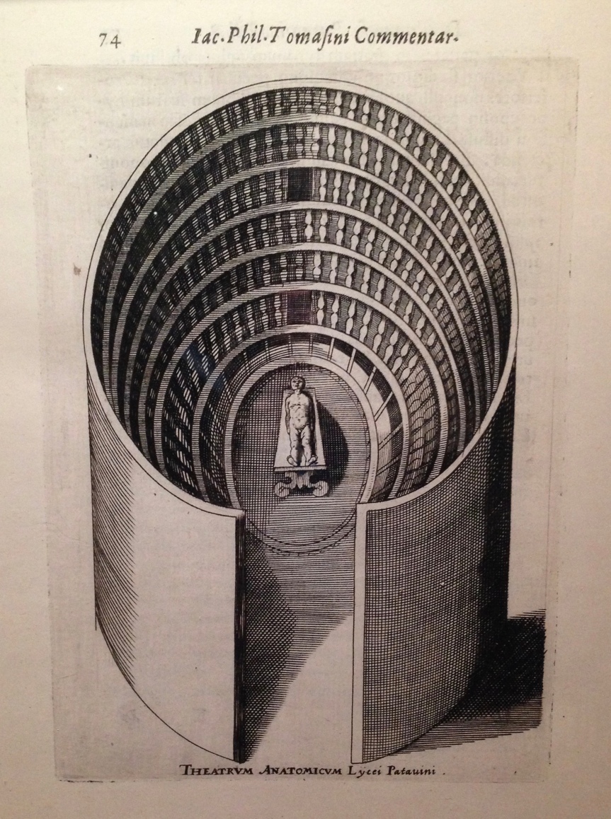
Theatrum Anatomicum (Anatomy theatre). Bodleian Library. Photograph my own.

It is natural to assume that the exhibition would focus on Shakespeare’s tragedies, since we humorously divide his writing into two synopses: everyone dies (tragedy) or everyone gets married (comedy). Even in the comedies, though, death features heavily: a stay of execution (Measure for Measure), duels (Much Ado about Nothing), or fleeing home under the threat of murder (Midsummer Night’s Dream). The exhibition presents influential texts, such as the 15th century morality play, Everyman, which influenced Measure for Measure and King Lear. The first playbook of Romeo and Juliet is displayed next to the text of Layla and Majnun, a similar, Middle-Eastern tragedy written in the 11th century.

Other cabinets tell of society’s relationship with death during Shakespeare’s lifetime. The exhibition starts with his birth, which occurred during the change between Protestantism and Catholicism. Curators explore the sharp differences between Catholic and Protestant England, emphasizing the question of Purgatory, and present each religion’s view on death through indulgences, prayer books, and John Foxe’s Acts and Monuments (commonly known as the “Book of Martyrs”). Cleverly the curators inserted a copy of Hamlet in with the religious debate on being or not being after death.

IMG_2234
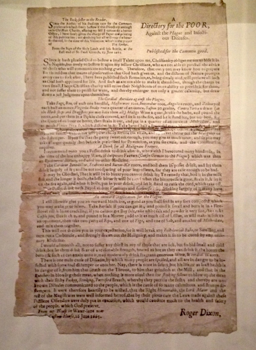
Directory for the poor against the plague. Bodleian Library. Photograph my own.

The plague stalked Elizabethan England, and was mentioned in a few of Shakespeare’s plays, including Much Ado about Nothing. A display dedicated to this exhibits historical documents like doctor handbills of cures (above) and reports of yearly death tolls and christenings. The only existing copy of the first edition of Shakespeare’s best-selling poem Venus and Adonis is also presented here, as Venus tricks Adonis into thinking that breath is a proper cure for the plague and that there was no better way to quicken the “cure” than sex.

Every label features a Shakespeare quote relating to death, which highlights the numerous references to it in his plays and sonnets. Usually the quotes link to the item displayed. For the doctor’s handbill, for example, the label begins with a Much Ado quote from Beatrice “O Lord, he will hang upon him like a disease. He is sooner caught than the pestilence, and the taker runs presently mad…it will cost him a thousand pounds ere a be cured” (1.1.81-5). The label explains that when Beatrice catches a cough, she is prescribed the thistle carduus benedictus—a pun on her soon-to-be lover’s name, Benedick—a cure that is on the handbill.

Some links, however, are tenuous. For example, the exhibition includes a 16th century swimming manual, and the label refers to Ophelia’s drowning in Hamlet. Because of the more unusual objects like this in the exhibition, the visitor is inclined, or almost forced, to read every label in order to identify each object and understand why it might apply to the author. The labels are long and some are placed too low to see from a standing height in the dark lighting (needed for paper conservation but likely doubling as a macabre effect). Fatigue sets in earlier when the eyes are straining.

IMG_2226

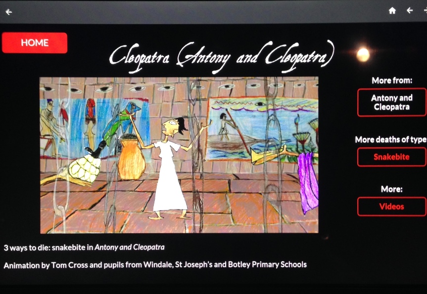
Secondary, supplementary objects are few but worth pausing at. Two iPads supply lists of Shakespearean deaths, which are searchable by play, character, or type of death. For a few deaths, like Cleopatra’s (above) from Antony and Cleopatra, local primary school children created animated cartoons and voiced the prose.

IMG_2230
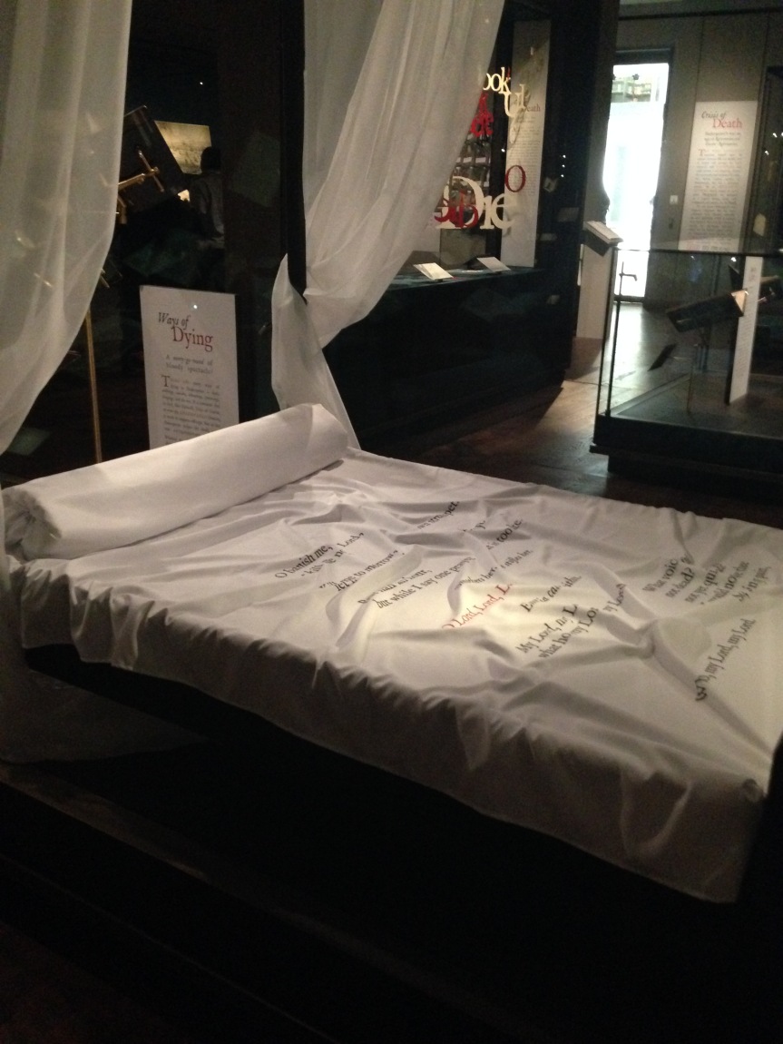
Installation of Desdemona’s bed. Bodleian Library. Photograph my own.

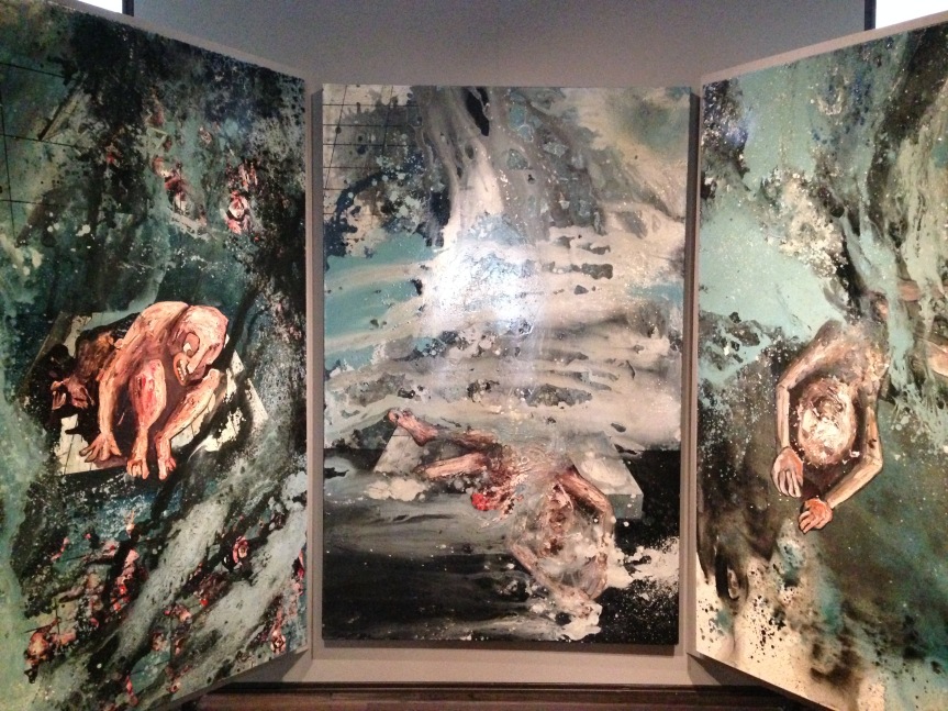
Shakespeare’s Dead also includes three installations made specifically for the exhibition. A full sized bed with Desdemona’s death scene printed on the sheets is striking and was made in recognition of hers being the longest on-stage death in Shakespeare’s cannon. A cabinet in the room holds no objects, but rather artistically displays words Shakespeare used as death cues. Shakespeare stood apart from other playwrights because he employed a repeating death cue, where the words or phrases were repeated, giving the dying role sole focus. In the hallway next to the exhibition stands an exceptional triptych created by Oxford artist Tom de Freston and personally commissioned by the Bodleian for this exhibition. The cliff scene in King Lear inspired the triptych, and a print of it lines the backing of a display case in the exhibition space. Feelings resonate more upon seeing the original painting in the hallway alone with no other objects competing for attention.

IMG_2242
Poor Tom triptych by Tom de Freston. Bodleian Library. Photograph my own.

It seems as if the idea of Shakespeare’s Dead began with a specific subject—Shakespeare’s use of death—which perhaps could not be fully realized with the objects available. By incorporating other objects the theme then became less clear, and constant references back to the author had to be made. Where there is a clear connection, the object becomes a unique insight into Elizabethan social history and societal relations. On the other hand, weakly made associations seem forced and confused. All things considered, fans of Shakespeare should still leave delighted, as will anyone who has a keen interest in the period.

Shakespeare’s Dead is at the Weston Library until the 18th of September.

Charles Fort, Kinsale

Slide01
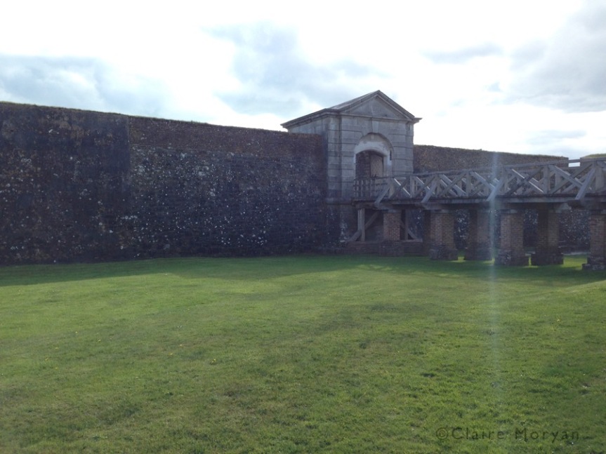
Charles Fort. Image: Claire Moryan

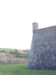
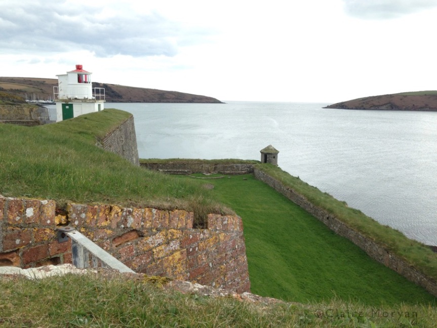
Charles Fort is situated on the edge of Kinsale Harbor, on the south coast of Ireland. Kinsale is a small but historically important town, and is situated where the Bandon River enters the Celtic Sea. Charles Fort commands the entrance to Kinsale harbor, with James Fort (an older, smaller fort) on the other side of the narrowest point. Named after King Charles II, the star-shaped fort was built in the 1670s on the site of an earlier stronghold. While built to withstand cannon attacks, the fort was not strategically placed: its position on the harbor prevented naval attacks on Kinsale, but all land surrounding the fort was higher ground. Ultimately this was to prove its downfall during the Williamite War in the late 1680s: the Jacobites holding the fort surrendered after ten days of assaults by the Williamites. The fort was an active military base until it was burned down in 1922 during the Irish Civil War. The land was left alone, becoming a hippie campsite in the 1960s before being named a national monument in 1971 and partly restored by the Irish heritage service.

Slide21Walking around the grounds, the heritage service’s dedication is clear. Even though there are not enough funds to fully restore Charles Fort, there are small things that catapult the experience at the fort to a higher level. An explainer stands at the ticket booth to give a brief explanation of the fortress layout. A beautiful mosaic map has been inlaid in the ground at the entrance. And, perhaps most importantly, you can enter the fort up to a point before paying. This means that you can still see what the fort has to offer, before paying the reasonable price of 4 Euro for an adult ticket.

Although the museums are sparse in objects, the time and effort the curators took to set up the exhibitions permeates throughout the space. The governor’s house now houses the main museum, which details the histories of Kinsale, Charles Fort, and James Fort. Panels are presented in both English and Irish, the two official languages of Ireland. Videos and interactive screens intermittently crop up in the space and serve as an educational break from reading. Visitors on the first floor can sit and watch videos chronicling the development of Kinsale and the forts from the 16th century to the present. In the following room, which tells of Charles Fort’s structure and engineers, visitors can use an interactive screen to build a fort of their own. This short interactive tests the ingenuity of the player, as one must strategically pick which type of fort would serve which plot of land best.

The second floor focuses more on the function of Charles Fort, both as a military base and living quarters for men and women. Rifles and 17th century cannon balls are displayed in one room, some of which were likely used during the 1690 siege of Charles Fort during the Williamite War. Wall panels discuss the invention of military advancements such as gunpowder and cannonade both on a general and local level, and a touch-screen allows visitors to scroll through a glossary of weapons.

Uniforms, old photographs, and campaign beds show a glimpse of the soldiering life in Charles Fort. In this room visitors learn of the sleeping arrangements (crowded and with only hay matresses), the governor of the fort, and severe punishments extending to public flogging or even execution. Punishment by death happened in many circumstances, like desertion or sleeping while on duty. Another insight into the social lives of soldiers regarded marriage. While there were marriage quarters, many husbands and wives slept with the others soldiers and were merely divided by a modesty curtain. Living in the fort meant food and shelter and wages, but this only pertained to marriages embedded into the unit. Soldiers marrying in such a way were chosen by drawing lots. Outside marriages, although not forbidden, were not encouraged, and no money and no assistance was given to these wives and children.

My favorite part of the museum is a video of a uniformed actor playing a soldier not so fondly recalling his times of war and peace at Charles Fort. It works well and does not feel contrived.

In the stable next to the governor’s house is a temporary exhibition for World War I (I do not know whether the stable is always an exhibition space). At Charles Fort two battalions of the Munster Fusiliers and the Connaught Rangers (the writers of “It’s a Long Way to Tipperary”) were stationed. Panels tell of overall Irish involvement in the Great War, the battalions’ participation, and an honor roll.

The gunpowder magazine mostly displays old pictures and discusses artillery further, but there is too much small text, which can make it difficult to hold your interest. I would recommend reading through it though, as discussion of shift-wear and special magazine clogs (to avoid sparks) put the dangers of an ammunition bunker in the middle of a fort into perspective.

Other than that, the visitors are left alone to explore the grounds. The fort and the vistas are beautiful. Looking out into the ocean from the bastions takes your breath away, and the investigation of dilapidated buildings, which were inhabited less than a century ago, opens the mind to creativity and imagination.

Charles Fort is extremely child-friendly, as it presents children with sprawling grassy hills and corners leading to new adventures. On a sunny day, I can easily imagine a family bringing blankets and a picnic basket and spend the day there as if it were a park. It is this type of accessibility that makes Charles Fort special. Bringing young children to a museum has unfortunately become frowned upon, but Charles Fort lets children be children in both an exploratory and educational environment.

Slide23
Image: Claire Moryan

Charles Fort is different from my previous reviews in that it mixes museum, historical house, and ruins together into one attraction. When someone suggested that I visit it, I underestimated how expansive and engaging it could be. Because of the work and energy put into Charles Fort with the small amount of funds available, it is easy to conceive how much love would go into a fully funded fort. Perhaps a renovation of all the buildings would occur, or the video-actors would become live, costumed performers for public engagement. The partially renovated fort gives the mind a glimpse of what could be, thus forming a desire to see the entelechy of this possibility.

Slide20
Image: Claire Moryan